Choose a short story and turn it into a mini graphic novel. The length of the graphic novel will largely depend on the story you choose, so pick something manageable. Aim to work over two or three pages only.
Be creative with how you approach this. Think about how you edit the story, the kinds of shots you take, the relationship between the dialogue and the characters. How do you depict the sounds and describe the action both visually and in terms of text?
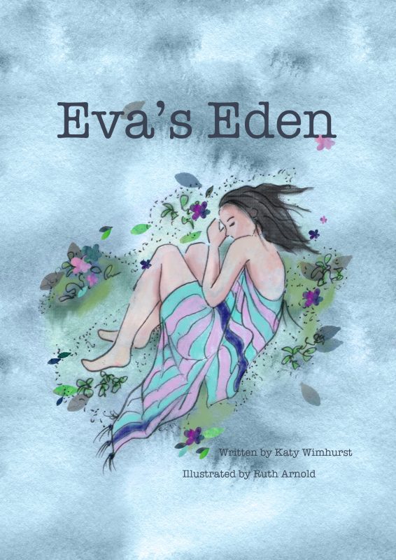
Along with the narrative itself, design a cover for your graphic novel that includes the name of the short story, the author’s details and your own.
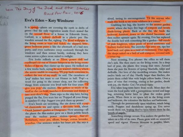
Huge thanks to my friend Katy Wimhurst who has kindly given me permission to use her wonderful short story ‘Eva’s Eden’. [Eva’s Eden From ‘The Day of the Dead and Other Stories’ Black Pear press, 2016] It is a strongly visual piece, which I think should translate well into illustration. I’d ideally like a lot more time to work on this, so I’m hoping I can do it justice.
Research
I’ve mentioned in previous blog posts that I’m new to graphic novels. Ive enjoyed looking into this genre and even treated myself to this book by M Alice LeGrow.
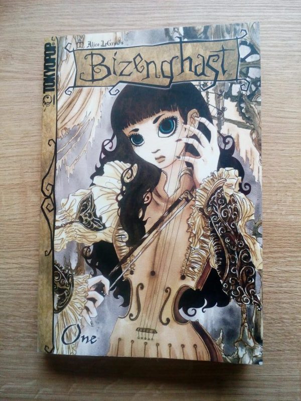
She creates beautifully detailed illustrations, paying particular attention to architecture and costume. Her inking is exquisite. I’ve also noted she applies layers of digital halftone dots and texture that support a cohesive style.

In contrast, I love Raymond Briggs too – for many reasons – one being that he has always achieved lovely hand drawn work in muted colour palettes. His cartoon style has never jarred with heartbreaking subject matter.
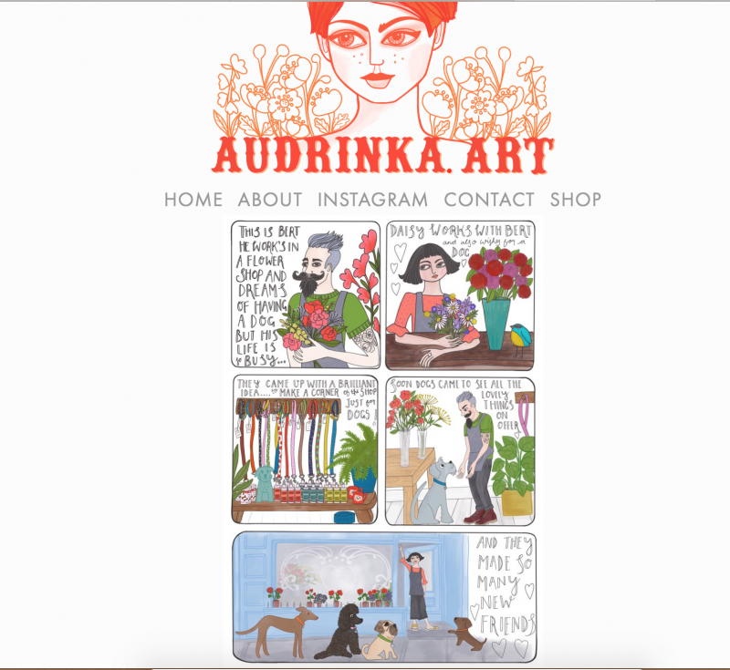
I’m surprised to find there’s are quite a lot of women producing sequential illustration. For example, here’s a screenshot of Audrinka Weite’s home page. Colourful, whimsical and charming.
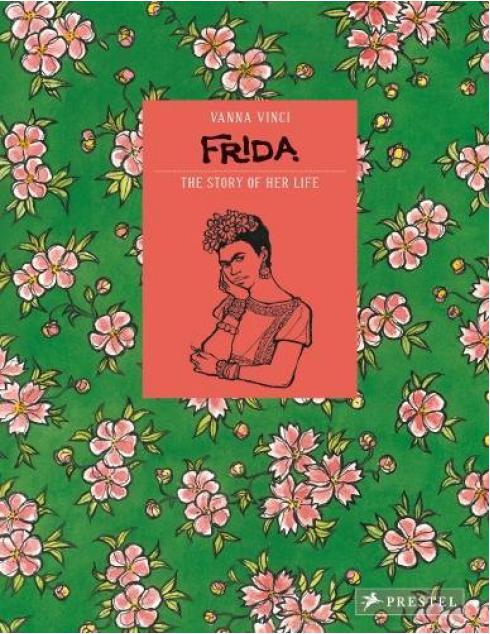
Vanna Vinci’s graphic novel about the life of Frida Kahlo. (Fantastic subject eh) This cover reflects the vibrancy of Frida’s life and work combined with a contemporary feel.
Thumbelina a graphic novel for younger readers, illustrated by Sarah Horne.

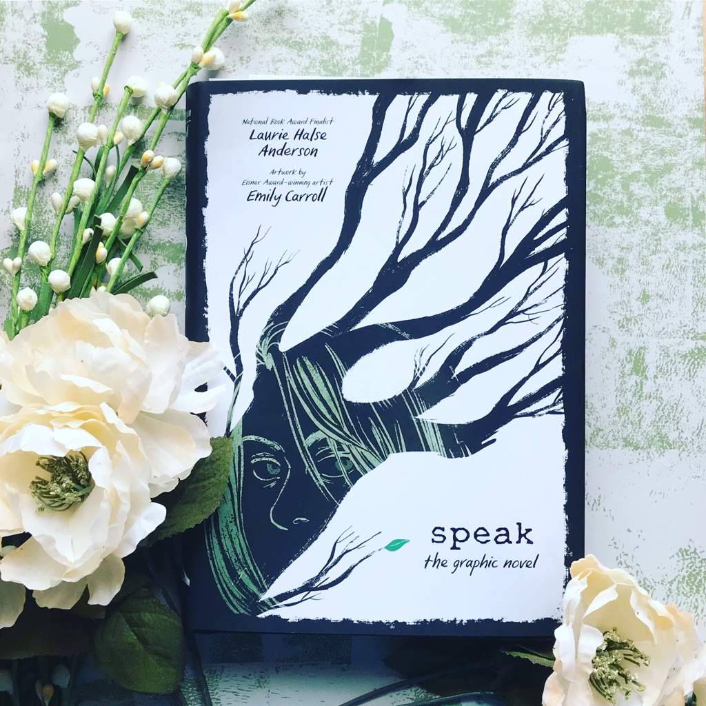
Speak by Laurie Halse Anderson & Emily Carroll. Stylish and timely. I like the bold graphic cover.
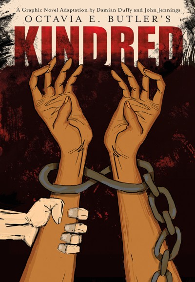
It seems that graphic novels aren’t afraid of tackling very poignant and traumatic subjects, such as this one about slavery adapted by Damian Duffy and John Jennings from the novel by Octavia Butler.
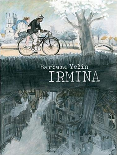
And Barbara Yelin’s exploration of the politics of World War 2.
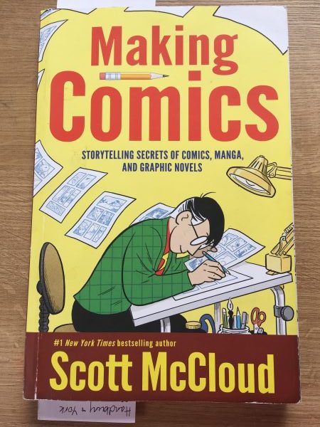
I made a lot of notes about how to construct graphic novel pages, from manga artists such as Mark Crilley, Skillshare and the ‘bible’ of this genre by Scott McCloud. It covers all aspects of visualising and constructing graphic novels, and will remain a great reference for any future work.
My notes


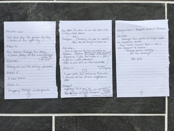
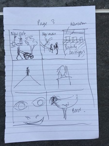
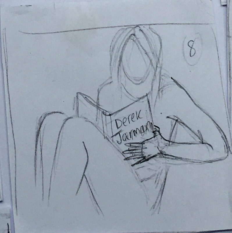
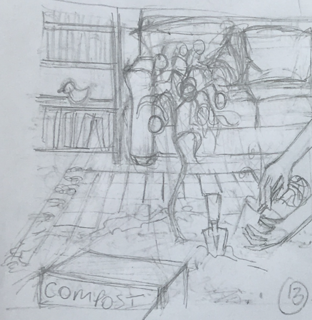
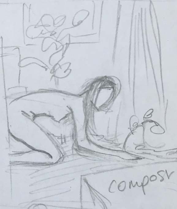
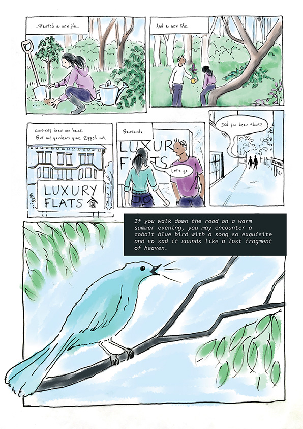
I read Katy’s text thoroughly to try and pick out the main points of the story, ‘props’ and scenes.
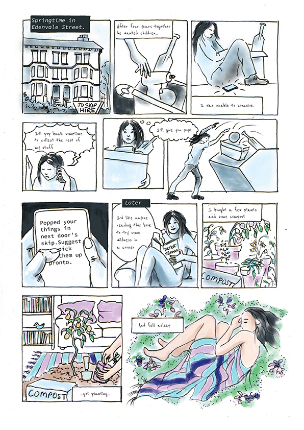
I listed what was happening, what is said, and what can be seen. While doing this, I’m thinking about whether the narration should be first or third person, what actions need to be shown (and which are less important) and any changes that need to be made. For example, Eva’s boyfriend leaves behind a life-sized cutout of Homer Simpson. But visually this may be tricky in terms of copyright?
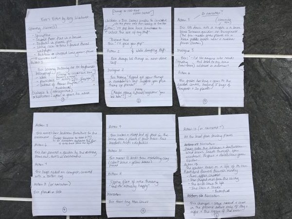
I’ve also pondered details such as when Eva is texting, should I attempt the make the phone ‘screen’ readable, or does she mutter out loud? A small part of the action takes place in the past – do I show this or simply narrate and summarise certain events. Which dialogue needs to stay, and which should be replaced by visuals?
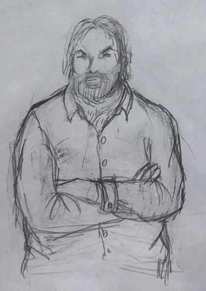
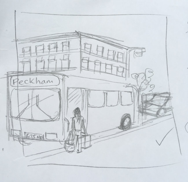
There were a lot of questions I was asking myself! What does the exterior of Evas flat look like? Modern or traditional? The text says its part of a house, so Im thinking Victorian or Georgian might be good, and it is described as shabby.
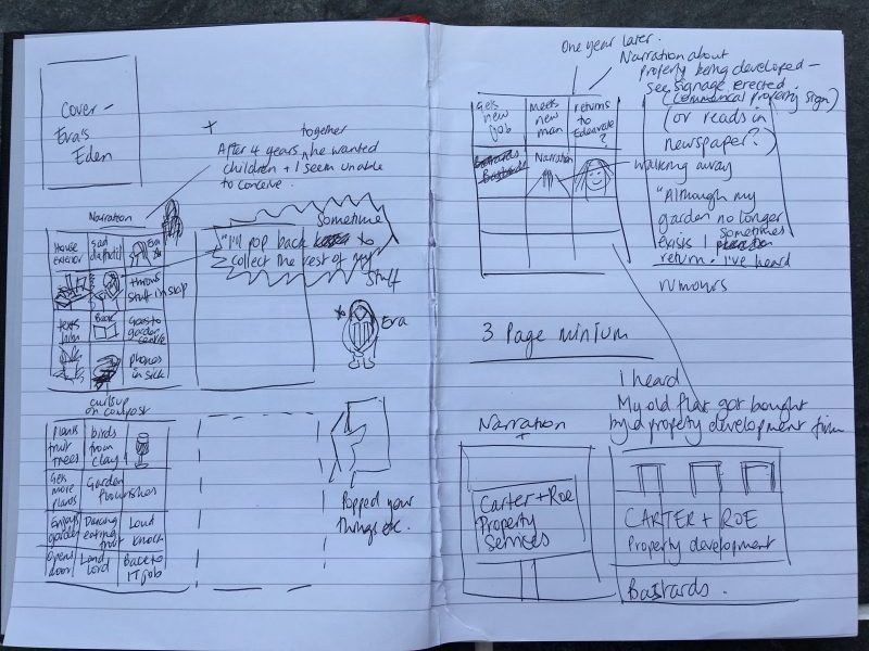
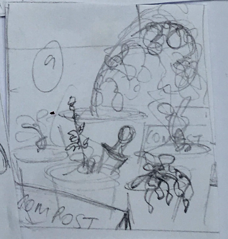
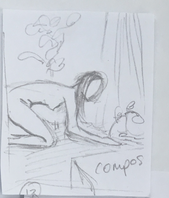
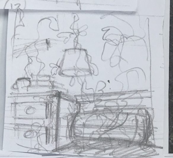
Brainstorming panel content.
I noted that some illustrators just write in the main parts of the story at this stage so although I’m thinking visually, I’m not that focused on drawing yet. (Yep, ugly biro scrawl to prove it)
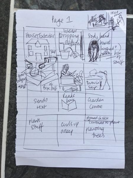

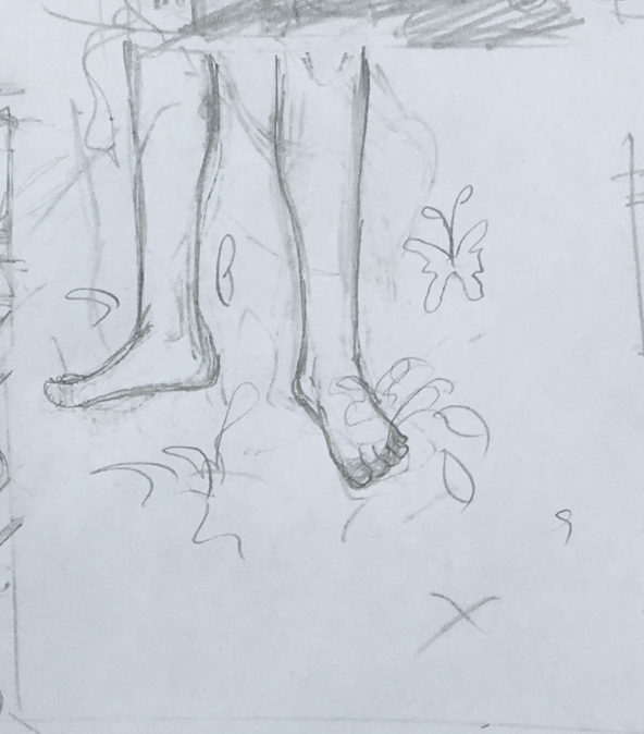
As Eva’s flat becomes like a garden of Eden, I referenced a lot of house plants, ceramic birds (which appear in the story), snakes, butterflies etc. Also floral designs, and artists such as Henri Rousseau are on here.
And I hoarded further reference pictures such as a london bus, and assorted items on my laptop. Katy mentions some plants by name so I wanted to grab some images of those (eg what shaped leaves certain fruit trees have) Although accuracy isn’t always the first priority in illustration, its good to have some grounding if needed! Or just to help with inspiration.
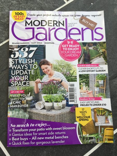
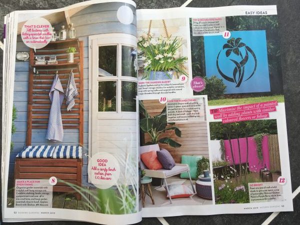
Plus I even bought a gardening magazine for good measure. (Im completely ignorant about plants)
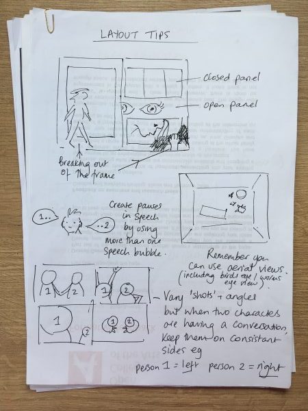
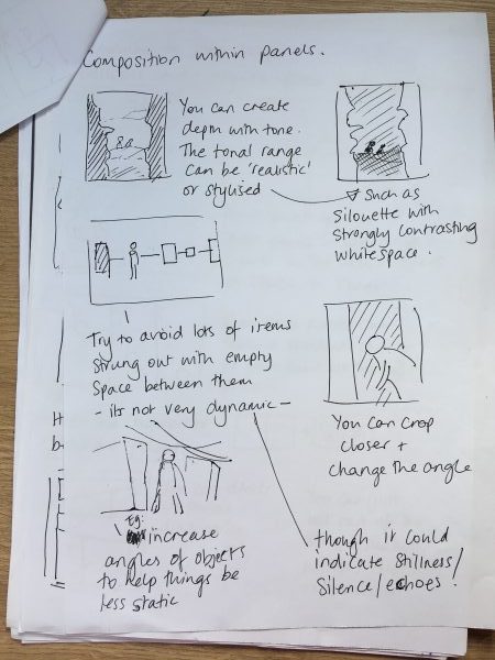
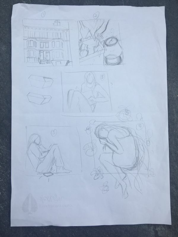
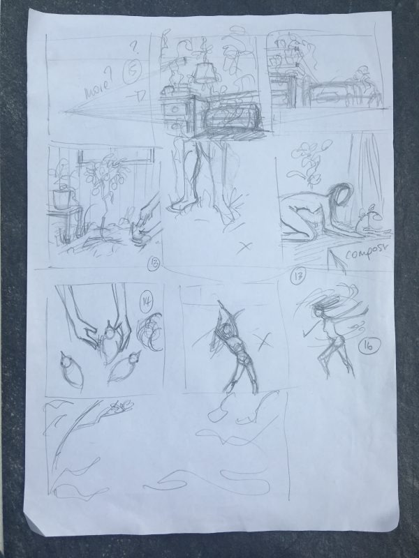
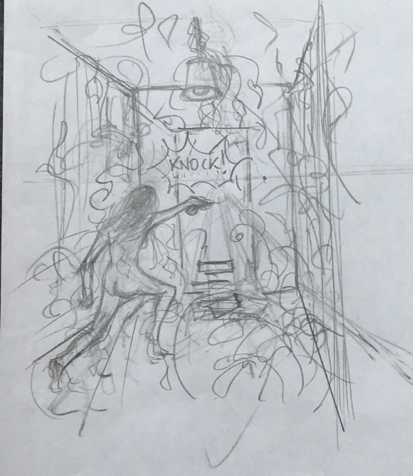
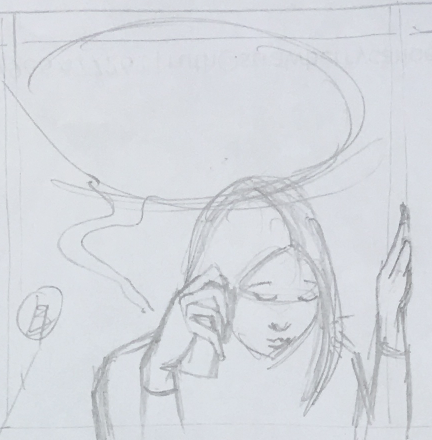
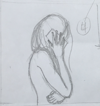
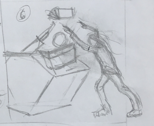
Next I needed to try and develop some rough sketches based on my research, and to further explore ‘camera angles’ and storytelling scenes. Plus balancing Katy’s ‘voice’ in the narration and dialogue with the needs of visual adaptation.

Meanwhile, I needed to be sure I’d created large enough text boxes to contain the words I needed and selected the typefaces that seemed suitable for both narration and the more personal human elements.
I did this in Illustrator, and imported my sketches which allowed me to experiment with the sequence and relevance of each image.


Once my layout was taking shape, I printed them off to ink by hand. (I wanted the boxes to look hand drawn, plus I enjoy inking on paper.)
Once inked, I scanned back in to tidy up and apply colour digitally.
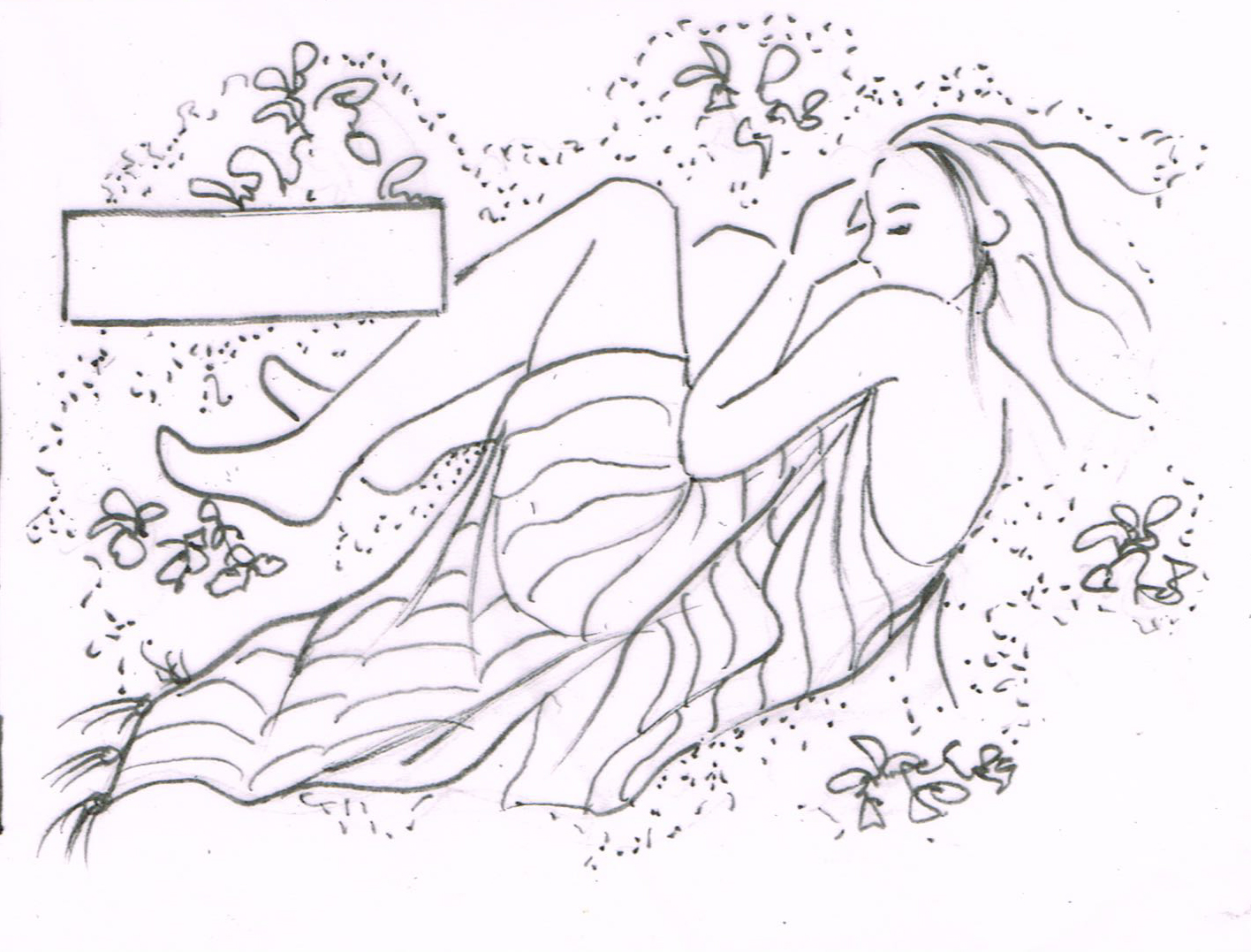
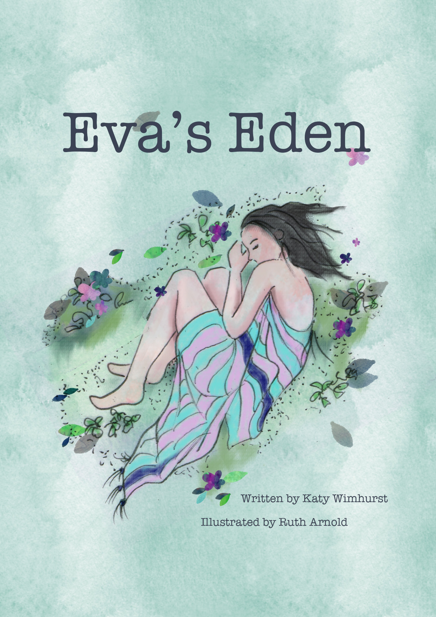
It seemed best to plan my colour palette starting with the cover first. This panel from the story seemed like the perfect image to use.
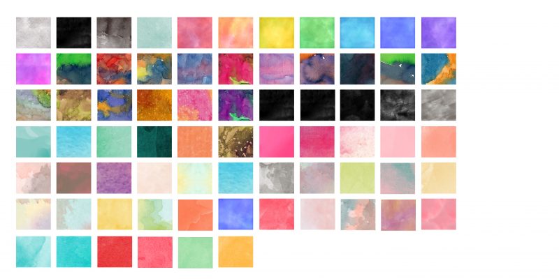
I have been hoarding watercolour styles in the Styles panel to add some more ‘handpainted/organic’ effects to my digital artwork, and was the perfect opportunity to apply them.
Here’s my stash:
Most of my palette needed to be shades of green, as the story contains a lot of plants. I expanded from there, but made sure to limit the overall number of colours.
When it came to applying colour to the panels, I wanted to go from monochrome to full colour as the story evolves.
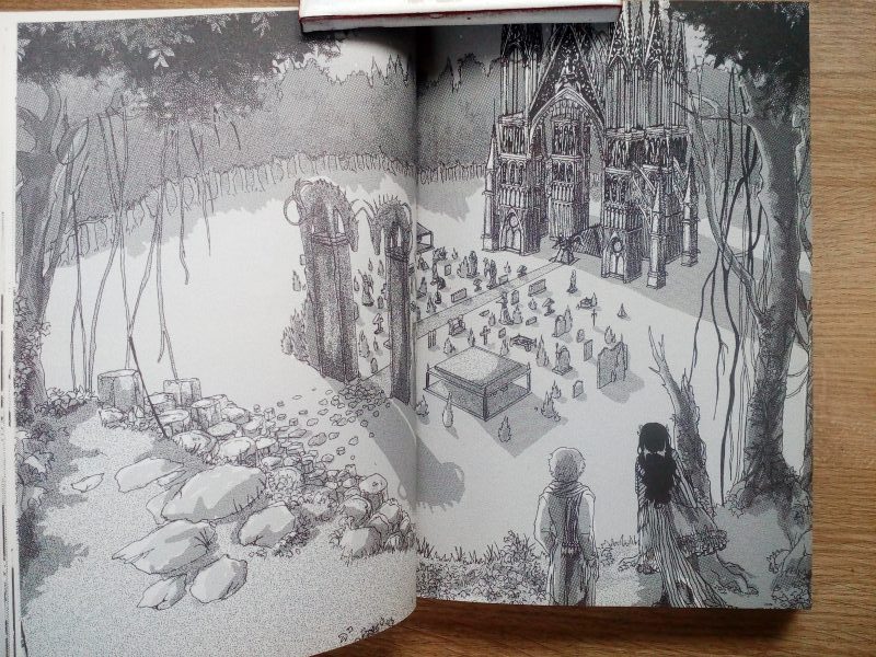
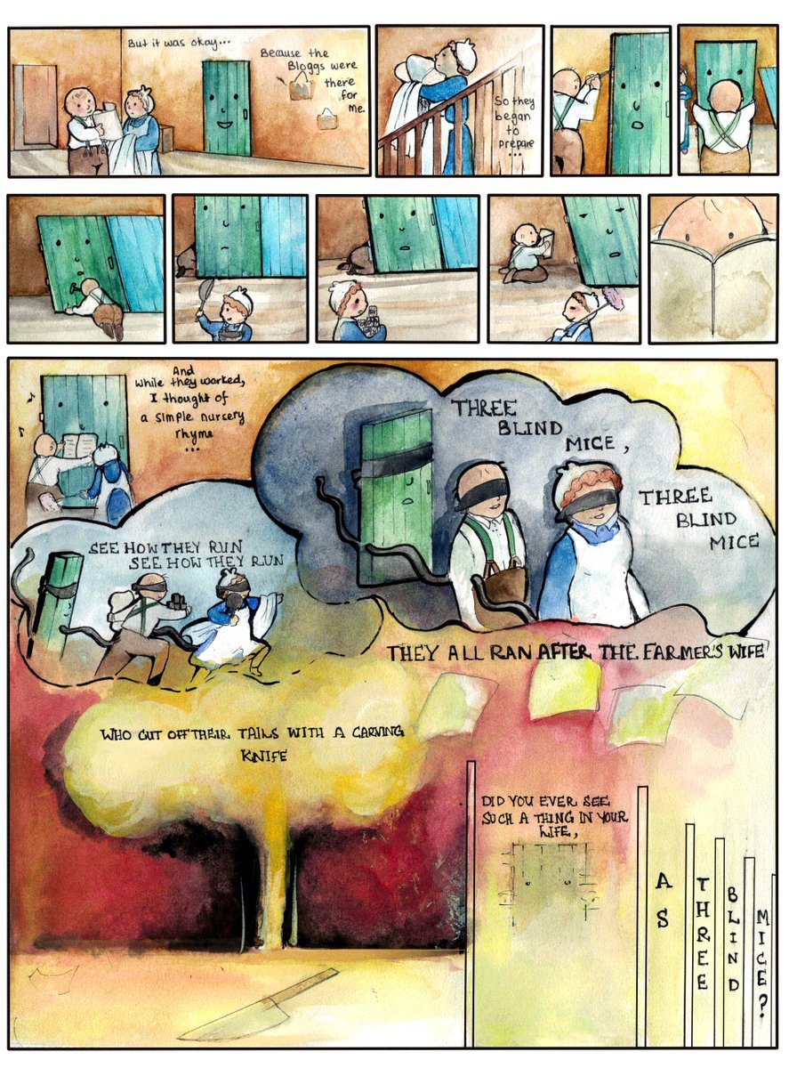
I used various brushes (eg watercolour and chalk) to allow for a soft texture, applied via my graphics tablet. And finally (drum roll….) here it is.
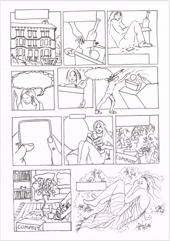
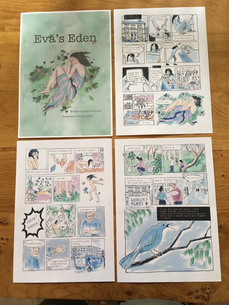
My Graphic Short Story – Eva’s Eden
(Click each page to enlarge)

The final part of my process was to print out my panels to see how they looked on paper. I had two cover choices. Prior to printing, this was my favourite, but it really only has the desired effect on screen.
However, the other files came out pretty well I think… It’s so easy to assume you know the way images will appear, but obviously there will always be a shift (in this case with detail, colour and texture). I’m trying to make a mental note to ALWAYS do this if I intend to print artwork it’s too important to overlook!
Reflection
Reflect on the experience of converting the text to a visual form. What did you learn from this experience? How have your illustrations developed to accommodate the demands of the narrative?
I found it really challenging to convert Katy’s story to visual images and very minimal text. I asked myself a lot of questions about what were the most important elements of the story, and how to cull certain details, even if I was sad to see them go.
Katy writes lovely prose, and I made sure to include her text exactly in the final frame. In other areas, I paraphrased or simplified both the text and narrative detail. For example, in the original version, Eva moves her furniture out of the flat. I left it in, as I think it worked well visually to have plants growing alongside ordinary domestic objects, and reinforced the fact that the garden is growing inside.
I also didn’t manage to include details such as seeds blowing in through the window, and her writing on the walls by crushing beetroot. Also, the landlord has quite a bit more to say about his faith and the abomination that has taken place inside his property. I didn’t think I could achieve all this within three pages, but I really hope I made the right choices in staying true to the essence of her story. I feel I learnt a lot about adapting text to a visual story, and even more about how to decide what is vital to show in a panel, and what can be ignored as extraneous visual information. I also weighed up the relative size of panels and areas of emphasis. With an awareness that this effects the pacing. I did feel that limiting myself to only three pages actually made the storytelling more difficult.
My illustrations had to be driven by the narrative, I couldn’t veer off at any time which was a useful discipline. Luckily, this sort of work suits my general style of drawing I think. In hindsight, I would have ideally liked to develop Eva’s face a little more, (something I didn’t fully notice until I’d finished – my focus was on her body) but I think the images hang together as a fairly consistent group. Technically, there are some drawings that are weaker than others but I feel reasonably confident I’ve told the story clearly and created a pleasing softness that suits the subject matter.
Update:
Creativity
Strengths – Its difficult to say if my response is particularly creative because I was responding to the writers imagination! (So surely I had a great prompt) Anyway, I very much enjoyed adding my creative input, and loving the subject matter helped!
Weaknesses – Not sure, I’m fairly happy with what Ive done here, I’ll need time to develop more as an artist to understand how else I could have tackled this.
I could perhaps played with mixed media and more texture during the colouring phase and a variation in line quality might have been interesting.
Research
Strengths – I really enjoyed researching this, I’d already looked into graphic novels and sequential illustration which was a great help. In addition, I collected a ‘treasure trove’ of Pinterest images inspired by the topic of Eden (or this particular Eden) which will also inspire me for further projects.
Weaknesses – When do you stop researching and start the project? Research can be a really sneaky way of procrastinating.
Visual and technical skills (including line, form, colour, composition and shape)
Strengths – I think my images supported the spirit of the story well, and are visually pleasing. I like the colour palette, and the style of illustration suits the subject matter. I’m happy with the layout and pacing too. I felt my drawing skills were ‘up to the job’ having done a fair bit of figure drawing now. (Its a good feeling when sketchbook practise pays off)
Weaknesses – I always feel my analogue to digital workflow could do with a bit more thought. I don’t like doing rough sketches on the computer – I much prefer paper – which is fine, but I would benefit from a bit more forward planning about what Im going to do subsequently, with which device or programme. (For example, Photoshop, Illustrator or Procreate and in what order) Ive been using a very slow (and extremely basic) graphics tablet, that usually has me reverting to simply using my track pad on the laptop. Ive been promising myself a decent graphics tablet for the next level course. My usual kit has really been hampering my digital line quality (as there’s no pressure sensitivity) and its just a clumsy way of working.
Context
Out of curiosity, I looked into graphic novel short story collections that are available, and it seems there are more than I realised!
Here’s a great summary as listed by Bustle, encompassing a wide range of subjects from whimsical to horror.
https://www.bustle.com/p/9-graphic-story-collections-you-didnt-realize-you-needed-in-your-life-34696
As I mentioned previously during my research, I was delighted to find that a growing number of women have worked on graphic novels and sequential illustration projects. Obviously we have a great example at the OCA, as my previous illustration tutor was Beth Dawson. The Guardian/Observer/Cape graphic novel short story annual competition attracts really high quality entries.
Beth has explored different substrates while working on this piece, and has an ability to tell beautiful, emotionally resonant visual stories. I didn’t aspire to attempting a graphic short story at the time of seeing her work, but I think it has lurked in my subconscious as a good example of how women are definitely holding their own in this traditionally male field.

One thought on “Assignment Three – A graphic short story”